Animated Beam: Visual Connections Between Elements in Vue
Animated Beam draws a glowing, animated path between two elements — expressing flow, interaction, and connection through motion.
Rahul Vashishtha
Interfaces often focus on components themselves — cards, buttons, text blocks.
But what gives them meaning is the relationship between those parts.
Motion is one of the most effective ways to communicate those relationships.
Animated Beam was built for that purpose.
It visualizes connection — a flowing line of light that quietly explains how one element leads to another.
Designing for connection
When users interact with an interface, actions rarely happen in isolation.
A click, a toggle, or a data fetch often affects something elsewhere on the screen.
This connection is usually invisible, which makes systems feel disconnected.
Animated Beam turns that invisible thread into something visual —
a thin, animated path that moves energy between elements, suggesting intent and continuity.
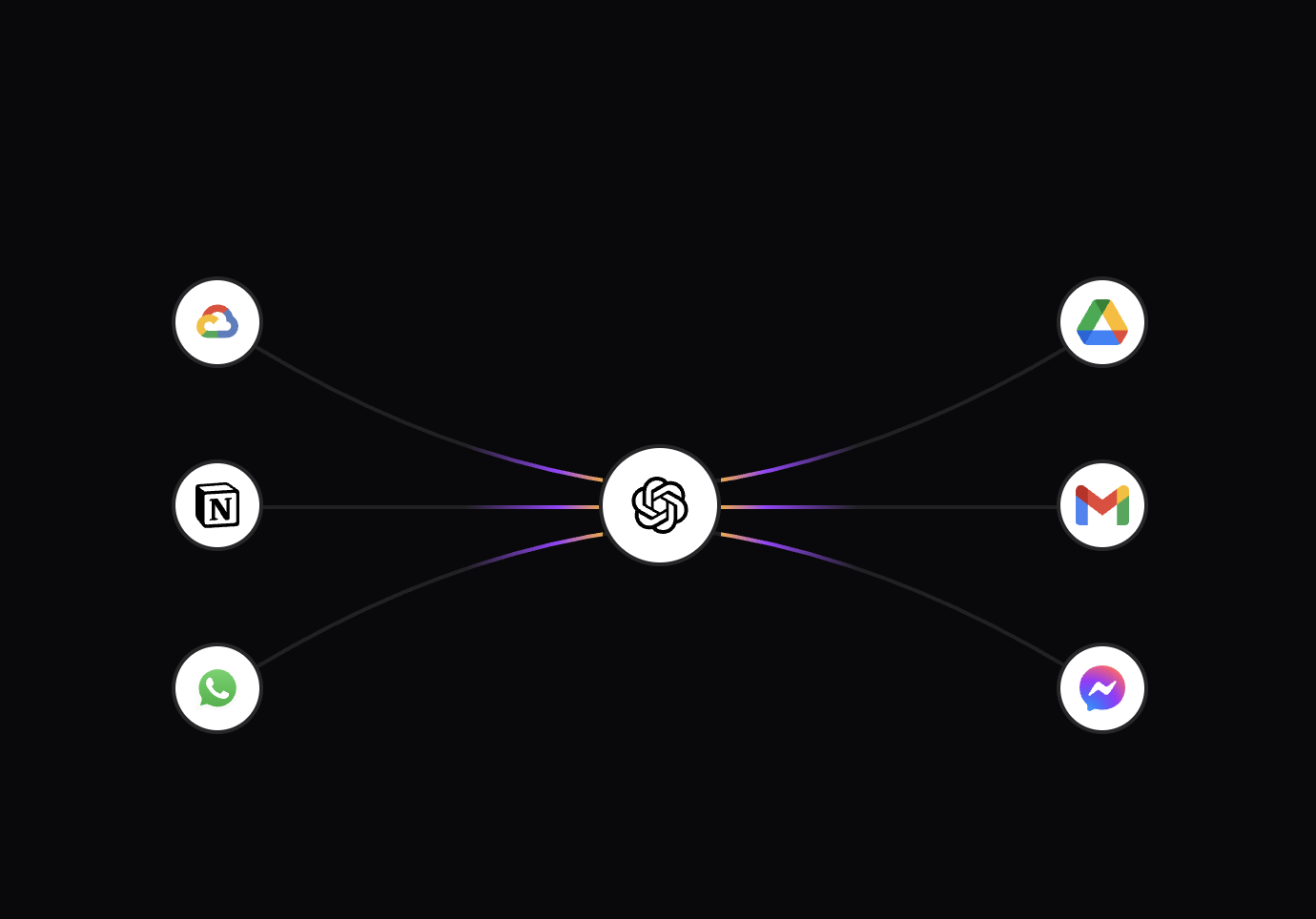 Animated Beams - Inspira UI
What it does
Animated Beam continuously animates a gradient along a curved SVG path.
It connects two references inside a shared container and dynamically updates as the layout changes.
<AnimatedBeam :container-ref="container" :from-ref="cardA" :to-ref="cardB" />
Once placed, it quietly does its work — drawing, animating, and repositioning itself as the interface moves.
Structure and flow
The component renders an SVG containing two paths:
<svg>
  <path /> <!-- base stroke -->
  <path /> <!-- animated gradient -->
  <defs>
    <linearGradient>
      <animate /> <!-- motion along the beam -->
    </linearGradient>
  </defs>
</svg>
The first path provides structure — a faint baseline showing the connection’s shape. The second overlays a gradient that slides endlessly, creating the illusion of motion and energy.
The shape itself is a quadratic curve, defined by a start point, end point, and a slight curvature. This curvature softens the path, making it feel organic instead of mechanical.
Motion through light
The animation is handled directly in SVG, using <animate> on the gradient coordinates.
This approach avoids JavaScript-driven re-renders and keeps the motion independent from the main thread.
<animate
  attributeName="x1"
  :values="x1"
  :dur="`${duration}s`"
  keySplines="0.16 1 0.3 1"
  calcMode="spline"
  repeatCount="indefinite"
/>
The effect is subtle — a steady light that glides from one end to the other, like a signal traveling through a wire.
Because each beam’s duration is slightly randomized, the overall movement feels unpatterned and alive.
duration: Math.random() * 3 + 4;
It’s these quiet variations that make the interface feel less synthetic, more natural.
Geometry and precision
Every time the layout changes, the beam recalculates its coordinates. It measures the container and the two elements it connects, then redraws the path.
const d = `M ${startX},${startY} Q ${(startX + endX) / 2},${controlY} ${endX},${endY}`;
This ensures the beam always aligns perfectly, no matter how the interface shifts or resizes. It’s a subtle detail, but it keeps the illusion intact — the beam feels anchored to the components it connects.
Responsiveness by design
A ResizeObserver watches the container and triggers updates whenever dimensions change.
resizeObserver = new ResizeObserver(() => {
  updatePath();
});
This responsiveness is more than just resizing; it’s spatial awareness. Animated Beam adapts in real time, keeping its motion believable in dynamic layouts.
Customization
The component exposes a few parameters to adjust its style and rhythm:
| Prop | Type | Default | Description |
|---|---|---|---|
curvature | number | 0 | Controls the arc of the beam between elements. |
reverse | boolean | false | Reverses the direction of the gradient motion. |
duration | number | 4–7 | Controls how fast the beam’s light travels. |
pathColor | string | "gray" | Color of the static line. |
gradientStartColor | string | "#FFAA40" | Gradient start color. |
gradientStopColor | string | "#9C40FF" | Gradient end color. |
pathOpacity | number | 0.2 | Transparency of the base path. |
pathWidth | number | 2 | Width of the stroke. |
By fine-tuning these, you can shift the personality of the beam — from quiet signals to expressive, glowing lines that highlight key interactions.
Performance and simplicity
Everything runs natively inside the browser’s compositor layer. There’s no frame-by-frame JavaScript loop, no manual re-rendering.
That means the beam remains smooth even in complex layouts or with many instances active at once. The performance comes from the same principle that defines the component: do less, but do it with precision.
Subtlety as a feature
Animated Beam isn’t meant to grab attention. It’s meant to guide the eye — to make the interface’s logic visible, to show that one action influences another.
Used thoughtfully, it can turn static systems into something that feels responsive and alive, without ever being loud about it.
A closing thought
Good motion often goes unnoticed, and that’s what makes it powerful. Animated Beam is a reminder that even a single line, moving at the right pace, can communicate intent better than words or icons.
When design and code align in rhythm, interfaces stop feeling digital — and start feeling human.
Link To Component:Animated Beam - Inspira UI